About my experiences with Gephi: the steps I took, what worked and what did not work.
Now that I had a workable dataset (please read part 2), I was ready to visualize the hyperlink network. In Archives, Access and Artificial Intelligence – Working with Born-Digital and Digitized Archival Collections, this visualization is defined as follows:
“A network graph can be built by representing each web page with a node (visually represented as a circle), and creating an edge (visually a line) between two nodes (or pages) if they are connected by a hyperlink. The graph can be directed or undirected. In a directed graph edges can be thought of as arrows going from the source page of a hyperlink to the page it is linking to, so that a pair of nodes can have up to two edges in opposing directions between them. In the undirected case a link between two nodes would indicate that at least one of the pages has a hyperlink to the other. It may seem an obvious point but it is important to be aware that in the directed case that there will not be incoming links from web pages which are not in the archive. This (…) can also apply to websites of which the archive was unaware, or pages which no longer exist and have not been archived.”¹
In this present case: I am creating a directed graph where the archived web domains point to archived or not archived web domains.
Gephi
“Gephi is the leading visualization and exploration software for all kinds of graphs and networks. Gephi is open-source and free.”²
Many tools are available to those that want to visualize a network. For this research project I chose Gephi, an open-source tool that is used by many researchers. Installing the program was fairly straightforward. Because it is a much used tool, answers to questions are easily googled. The only problem I had, is that every time my Java updated I had to manually update the config file with the current version.
There are many possibilities to visualize a graph in Gephi. In this post I will only describe the functions I have used or tested and disregarded. For more information about other functions in Gephi please visit their website.
Here is a quick overview about which steps I took. I will elaborate on each step further on.
- Import dataset
- Execute statistic calculations Average Degree to get the degree-numbers for the whole dataset
- Filter on indegree
- Making Boolean columns: tagging all nodes with an out-degree and some Social Media
- (optional) Execute statistic calculations Modularity for the filtered dataset
- Design visualisation
- Lay-out: ForceAtlas 2, noverlap and adjust labels
- Give colour and size to nodes and labels
- Export graph in three formats (pdf, png and svg) and the whole and partial datasets (nodes and edges) as csv files
Visualizing the network
Step 1. Importing the dataset
As mentioned in the previous blogpost: when I finalized pre-processing the data in HeidiSQL and Excel I made sure I had three columns:
- Source, containing the URL on which a link was found (page URL)
- Target, containing the URL which was found
- Weight, detailing how many times the source pointed to the target (count*)
These three columns were imported in Gephi through the ‘Import spreadsheet…’ option. I imported them as an edges table and specified the ‘weight’ column as being integers (instead of the standard 'double') as they were always whole numbers in my dataset. I imported the files as a directed graph file.
I was able to import the first two datasets without complications (using .xlsx format instead of .csv). Each year however, the dataset got bigger because of (among other things) the growth of the KB web collection. As a result, the last two datasets crashed while importing through this menu with the ‘Overview’ tab opened. I tried bumping the memory in the config file to the maximum, but Gephi still crashed while trying to visualize the graph. The only thing that worked was switching to the ‘Data Laboratory’ tab while I was importing the data and not switch back to the ‘Overview’ tab until I had reached step six. This was an indication that I was reaching the limits of what Gephi could handle. In future research involving (for example) analyses of whole years instead of only the month September, it will be appropriate to add additional pre-processing steps in HeidiSQL to get a smaller export file. I could for instance calculate the indegree there and only export edges with a minimal indegree. Of course I could also search for a more scalable visualisation tool.
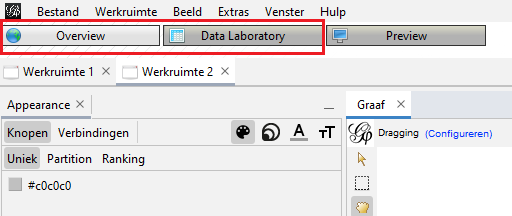
Figure 1: Overview and Data Laboratory tabs.
Step 2. Average Degree statistics
Through trial and error I learned to run the Average Degree statistic before filtering the edges. You can do it the other way around, but then it will only calculate the statistics on the filtered corpus. I wanted statistics based on the whole dataset, so after importing it I immediately calculated them.
When you use the Average Degree in Gephi you get three columns: indegree, outdegree and degree. Outdegree says how many times a node (a website) points to another node. Indegree says how many times other nodes point to that particular node. Degree is the sum of indegree and outdegree together.
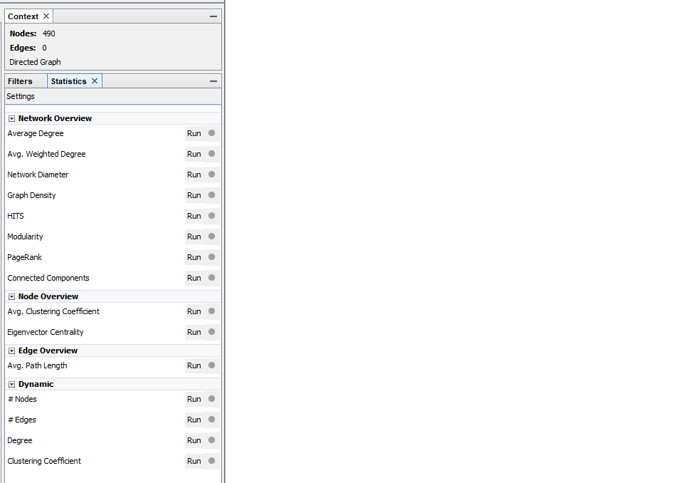
Figure 2: On the right side in Gephi the statistics menu can be found. There are multiple options for calculating statistics. I used Average Degree.
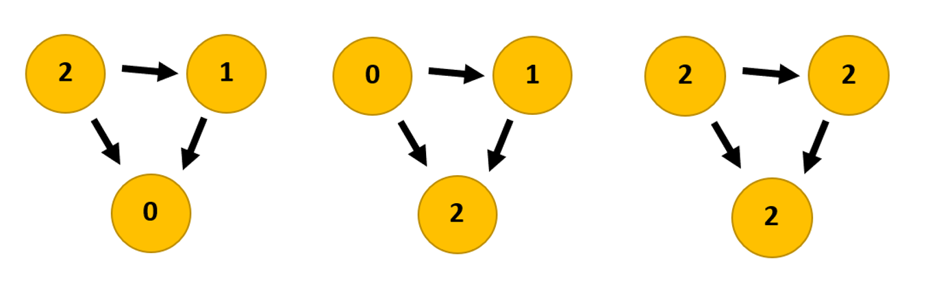
Figure 3: Link graphs showing the difference between the three statistics: outdegree, indegree, degree.
Step 3. Filter on indegree
After calculating the statistics (just an easy press on the ‘run’ button) you can now filter out any nodes that do not meet your criteria. In my case I filtered out nodes with an indegree range where you had to have a minimal indegree of 20 or more. I also made visualisation with a minimal indegree of 60 or more.
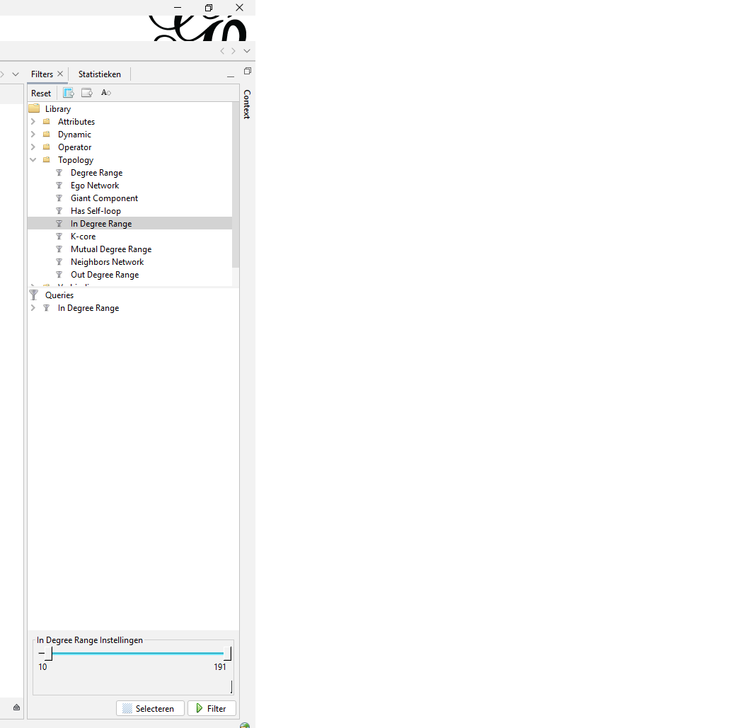
Figure 4: Next to statistics you can find the filtering menu. The option I used is found under ‘Topology’ and is called ‘In Degree Range’. On the bottom you can determine the range.
Step 4. Making Boolean columns
For the purpose of visualization I made two Boolean columns. These are columns where you can tick a box to indicate a yes or leave the box empty indicating a no. The first column I made is called WCT. Here I marked all nodes with an out-degree as being a ‘source’ node: a website which was archived in September (through the WCT software) and was a source on which URLs had been found. This way I could distinguish archived nodes from the not-archived nodes by giving them a colour based on this criterium in the final visualisation.
The second Boolean column was named ‘Social Media’. Here I manually selected some (not all!) Social Media platforms, namely: Blogspot, Facebook, Flickr, GeoCities, gravatar, GitHub, Instagram, Hyves, LinkedIn, myspace, Pinterest, reddit, Tumblr, twitter, vimeo, XS4all and YouTube. If a node contained one of these strings I ticked the box, indicating that ‘yes’ it was Social Media by my definition.
Because making the visualisation (and these columns) is manual work, it is easy to make a mistake and be inconsistent. For example in the 2010 visualisations vimeo is not marked as Social Media because I had not yet finalized the list I wanted to use. Of course I can fix this now, but as these blogs are also meant for readers to ‘learn from my mistakes’ I have left the mistake in there for now.
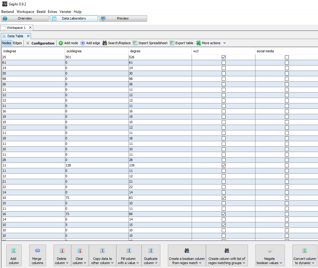
Figure 5: In the Data Laboratory menu you can add and edit columns. You can also view the columns made by running statistics options.
Step 5. (optional) Modularity statistics
Before I decided to make the WCT column I gave colour to my nodes based on modularity:
“Modularity is a measure of the structure of networks or graphs which measures the strength of division of a network into modules (also called groups, clusters or communities). Networks with high modularity have dense connections between the nodes within modules but sparse connections between nodes in different modules. Modularity is often used in optimization methods for detecting community structure in networks. However, it has been shown that modularity suffers a resolution limit and, therefore, it is unable to detect small communities.”³
This function is found in the same menu as Average Degree (figure 2) and gets calculated by simply pressing the ‘run’ button. Beware though of the sequence in which you do this. I for example placed this as step 5 because I wanted to calculate modularity on the filtered dataset (the data that was going to be visible in the final visualisation). If you want the modularity of the whole dataset, this best be done before filtering! After calculating the modularity you can give your nodes colours based on communities that have a close connection.
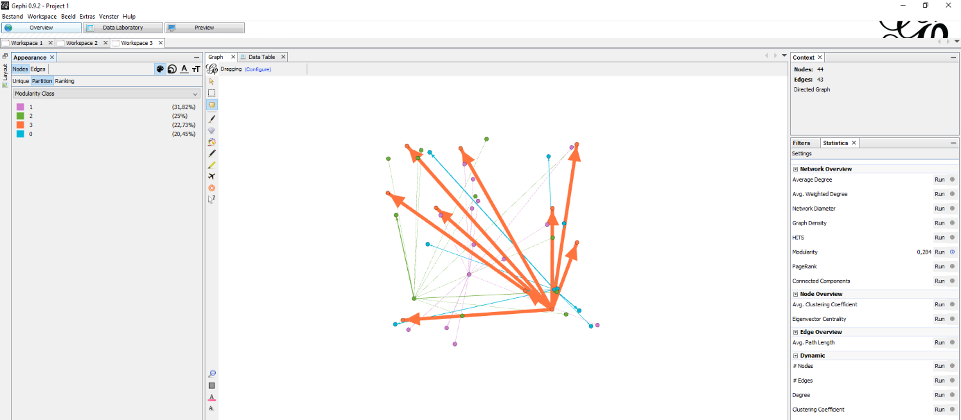
Figure 6: My first experimentation with a visualisation that used modularity to colour the graph.
In the end I thought it was more useful for my research to clearly identify which nodes were archived and which nodes were Social Media and not how dense the connections between the groups were. In the final visualizations I therefor skipped this step.
Labels
The previous steps, especially with the larger datasets, all took place in the Data Laboratory. There is one final little step I also took in de Data Laboratory: copying ID information from the ID column to the Label column. If you do this you can easily add labels to your visualisation. If you should import the data differently, this step is probably not necessary, but always check if this column is filled out when your labels are not appearing in the next step.

Figure 7: Data Laboratory options.
Now we can switch to the Overview tab in Gephi and start really designing our graph.
Step 6. Design visualisation
For the node size I used the ranking In-Degree with a minimum size of 5 and maximum of 15. The colour of the nodes was based on the ‘WCT’ Boolean column. Label colour was determined by the second Boolean column ‘Social Media’: if true, their labels got a blue colour. The labels are the same size as the nodes. This was the same for all visualisations.
For Lay-out I used ‘ForceAtlas 2’ to make the base visualisation. I mainly used two settings: ‘scaling’, which makes the graph sparser, less dense, and ‘gravity’, which attracts all nodes to the centre to avoid dispersion of disconnected components. I varied in my use of ‘scaling’ and ‘gravity’ because the visualisations got bigger each year. The settings used in 2010 (100 and 450) were not useable on 2019 (200, 950). I also used the lay-out functions ‘expansion’, ‘noverlap’ and ‘adjust labels’ to make the visualisation readable and avoid labels covering the whole graph.
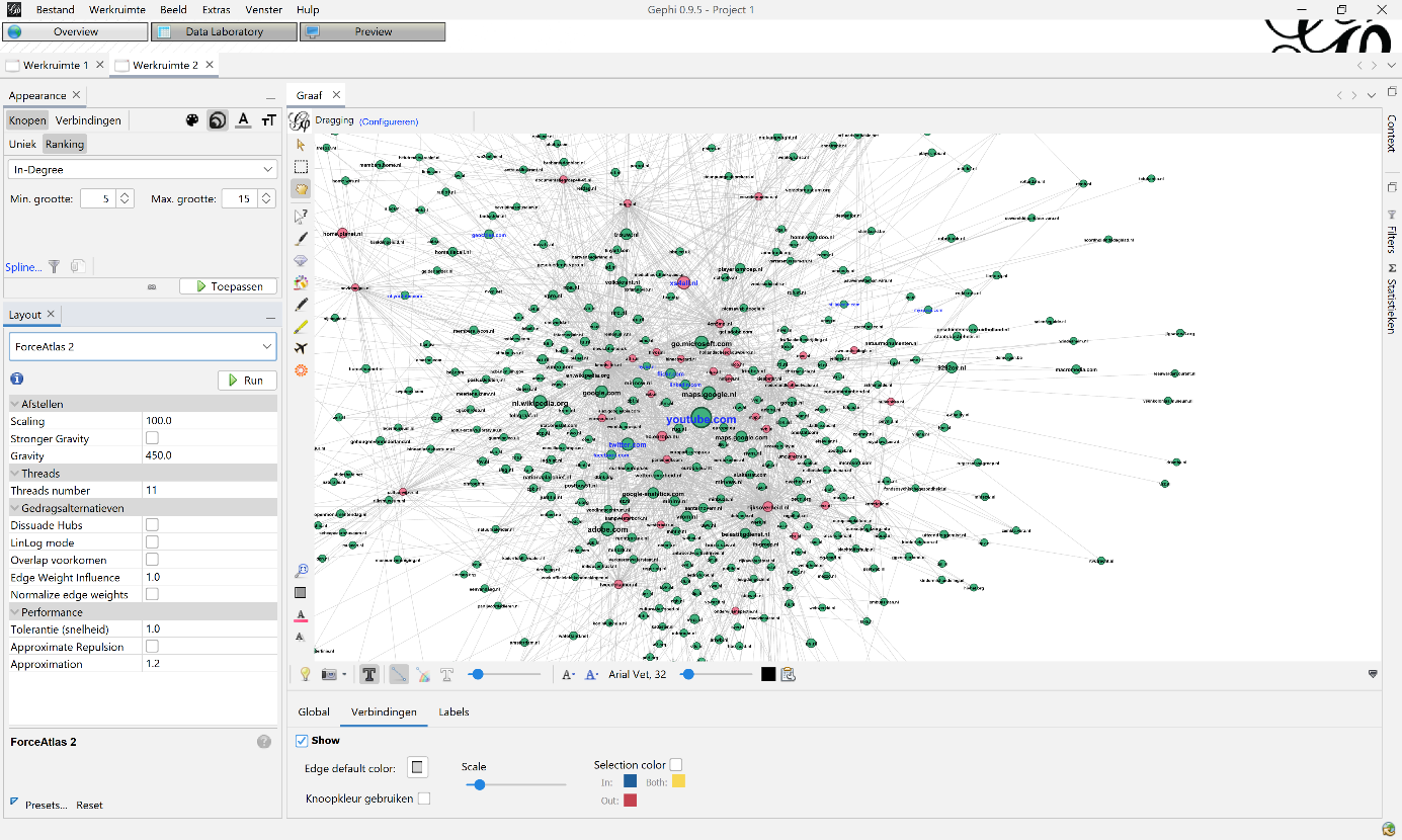
Figure 8: Example how to visualize your graph: on top-left you can change size and colour of the nodes, labels and edges. In this example you see the node size, based on the indegree statistic. On the bottom-left you can use different kinds of lay-outs to visualize your graph. In this case you see the ForceAtlas 2 settings.
Choosing between the three ‘degrees’ for node size took me a little while to figure out because I had to really learn about the consequences of working with a web collection. I will go into this more extensively in a later blogpost, but I will give a short overview of why I chose indegree here:
As mentioned in Archives, Access and Artificial Intelligence there is a disconnect between two groups of nodes in my dataset: namely the archived websites on which the URLs were found and the nodes that were just found. The nodes that were just found did not have an outdegree: they were not archived and as such they could not be scraped. Working with outdegree and degree was therefore not possible as they would both favour ‘source’ nodes that came from the KB web collection (which have an outdegree).
A second reason for choosing indegree was that I was actually actively searching for possible gaps in the collection, in particular social media platforms which were not harvested by the KB. Using Indegree gave me a better chance in finding them than using degree (which, again, favours archived nodes). This is also why I added the WCT column: to clearly discern the difference between the archived and not-archived nodes in de visualisation.
Step 7. Exporting graphs and the whole dataset
When all the above steps are completed, you can go to the Preview section of Gephi to view the final result. But honestly, I struggled quite a bit because it doesn’t always results in something you would expect from the settings in the Overview tab. Getting the right settings for this took some guessing and trial & error. But in the end I got an passable export profile which I saved and used as a base for all visualisations. There were, unfortunately, again some minor alterations needed because the visualisations got bigger.
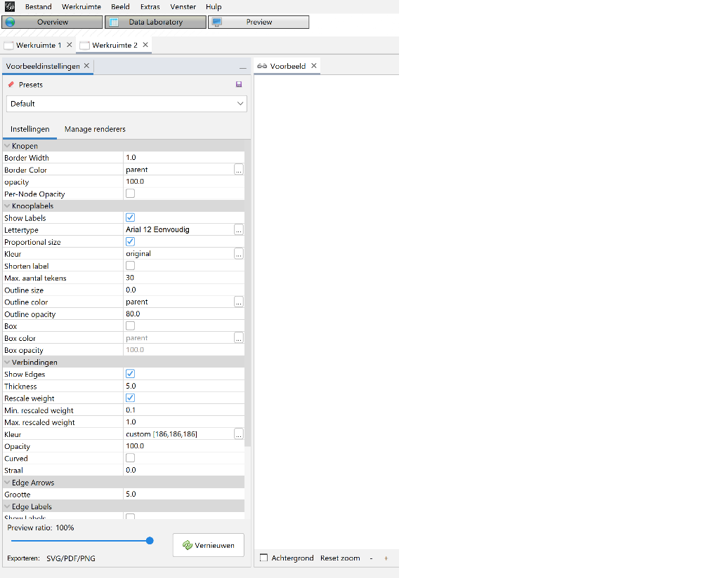
Figure 9: Export settings 2010.
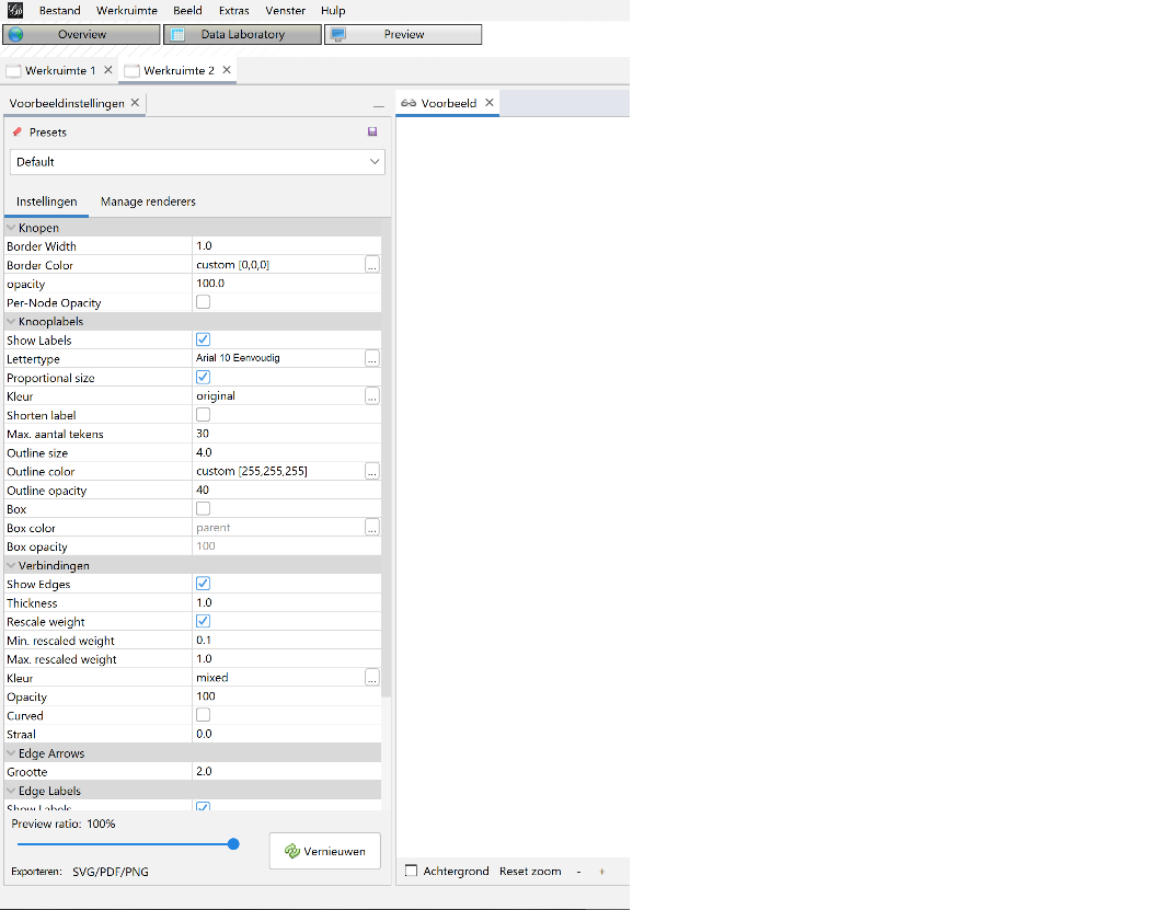
Figure 10: Export settings 2013.
After finetuning the settings I exported the graph in three formats: pdf, png and svg. Of those extensions pdf has the highest quality. Do mind the margin settings when you export or the graph borders might fall off.
After exporting the visualisations I also exported the data. I exported all the nodes and their additional columns added in previous steps. The edges data was also exported in full. Then I exported the nodes and edges again, but this time filtered to those with an indegree of 10 or more just to filter out a lot of noise. Because I added the Social Media and WCT Boolean columns after the dataset was already filtered to the indegree of 20 or more, not all nodes have this data in the csv export.
Trials and opportunity
About making a link visualisation in general
When making different link visualisations with different datasets it is hard to make comparable graphs. Even more so when the datasets greatly differ in size. As a researcher you should try to remain as consistent as possible with the settings. For example, when I started out I initially used different node-sizes in the different visualisations. This however distorted the graphs and made it hard to compare them. Same with the indegree filtering. This is why I tried to keep the settings as similar as I could when I made the final visualisations. Therefore I was quite disappointed when I had to make minor alterations in my export settings to make the graph properly readable: I really strived to make the visualisations as consistent as possible.
About Gephi
I found Gephi a very user-friendly tool with an intuitive interface. The different functions are easily found and also explained in the many tutorials found online. As mentioned above I did reach the limit with how much data Gephi could handle. The only function that I couldn’t get to work properly was the preview menu. Somehow it did not show me a preview of my graph and I never discovered why.
As a researcher who just started experimenting with link visualisations Gephi was a good starting point. Because I had to import my own data and edit it in the tool I could really see what each step did to the data and (if you read the tutorials) why. I feel that I now have a solid grasp on what I need to be aware of when making a visualisation. When I start working with even bigger datasets that need to be pre-processed in, for example, a Python script I can use this knowledge and apply it in a more computable environment. Gephi however I think still remains a solid tool for anyone who wishes to visualize graphs.
To be continued…
This ends the workflow descriptions blogposts. The following blogposts will be about the lessons learned and results. I start this off by delving into the analysis of the Gephi visualizations and finding out what happened to Hyves (a now offline Dutch Social Media website) that seems to have gone missing…..
Notes
1. L. Jaillant, ed., Archives, Access and Artificial Intelligence. Working with Born-Digital and Digitized Archival Collections (Verlag, 2022) page 73.
2. Gephi, https://gephi.org/, visited on 30 August 2022.
3. Wikipedia, https://en.wikipedia.org/wiki/Modularity_(networks), visited on 30 August 2022.

Related
Previous: How many hyperlinks?! - Link analysis part 2
Next: Wait... Where did Hyves go?! - Link analysis part 4
Glossary
Anchor link – for our research these are hyperlinks with a href tag (<a>, <link>, <area>)
Embedded link – for our research these are hyperlinks without href tag (<img>, <script>, <embed>, <source>, <frame>, <iframe> and <track>)
HeidiSQL - lets you see and edit data and structures from computers running one of the database systems MariaDB, MySQL, Microsoft SQL, PostgreSQL and SQLite. For our research we use MariaDB.
Gephi - a visualization and exploration tool for all kinds of graphs and networks. Gephi is open-source and free.
MariaDB - a relational database made by the original developers of MySQL, open source.
Target Record (or Target) – Contains overarching settings such as schedule frequency (when and how often a website is harvested) and basic metadata like a subjectcode or a collection label.
Target Instance - is created each time a Target Record instructs Heritrix to harvest a website. Contains information about the result of the harvest and the log files.
WARC – file type in which archived websites are stored. The KB archive consists of WARC and its predecessor ARC files. This project was done for both types of files.
WCT – Web Curator Tool is a tool for managing selective web harvesting for non-technical users.
Web collection – For the KB: they have a selective web archiving policy were they harvest a limited number of sites. You can find an overview of all archived websites at the KB on their FAQ page [Dutch].